
目次 / Contents
1) 友人のグループ展 /Friend's Group Exhibition
2) 2冊の小冊子 / Two Booklets
3) 会場 / Venue
4) トーク/ Talk
5) そのほか / Others
1) 友人のグループ/Friend's Group Exhibition
 |
友人のグループ展 友人、堀内君のグループ展が "アートサロン毎日"で開催されました。 彼のお師匠の 田村 空谷 (タムラ クウコク/ 1935又は36 - 2019 : ★) 氏 へのオマージュの意味が含まれた展覧会です。 展覧会のチラシ、カタログのデザインも堀内君がしました。 それらは彼の配慮が行き届き、思いの深さが感じられます。 Friend's Group Exhibition : "KATACHI ENO MANAZASHI" The group exhibition of my friend Horiuchi Kun was held in "Art Salon Mainichi", Mainichi Shimbun Tokyo Headquarters in Takebashi, Tokyo. This is an exhibition that includes the meaning of a homage to his master,Tamura Kūkoku (1935 or 36 - 2019). Horiuchi Kun also designed the leaflet and the catalogue for the exhibition. He paid a lot of attention to the booklets and I can feel the depth of his thoughts.  "KATACHI ENO MANAZASHI" means "Gaze to Shape" in Japanese |
堀内君は、グラフィックデザイナーであり、書家 (グラフィカル書家) です。
下記の彼の個展やグループ展には行っています。
グループ展 :
堀内 肇 個展:
今回の "かたちへの眼差し" 展も、'書道展' ではあるものの、通常の
書道展 (文字として認識される作品展) とは違うものであることは
心得ていました。
が、実際の作品群は、私が思っていたよりもずっと '文字' もしくは、'書' を離れていました。
通常の現代美術展の1つといった印象でした。
この展覧会には、私は夫Rと行きました。
Rは英国人で、日本語が読めません。
この展覧会は、そんなRでも理解できたように思います。
ただ基本、彼は現代美術が好きではないので、楽しめたかどうかは疑問です。
もちろん、私は楽しく作品群を拝見しました。
来年の個展に向けて、ほぼ毎日窯を作動させているので自宅を離れずらい状況下で見に行きましたが、十分にその価値はあり、とても良い刺激も受けました。
素敵なグループ展だったと思います。
ありがとうございました。
会場、堀内君にも、彼の奥さんのKさんにも、別の友人の
キヨちゃんにも会え、嬉しかったです。
和紙の件でキヨちゃんに相談したかった時なので、この偶然の出会いに感謝しました。
キヨちゃんの実家は田中和紙店で、彼女は、現在そこで働いているのです。
田中和紙店訪問について、下記。
Rも彼ら全てを知っていたので、喜んでいました。
私とRは、東京駅から展覧会前まで、観光を兼ねて散策しましたので、Rにとっても良い1日になったと思います。
散策については下記。
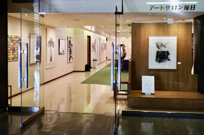 |
| 展覧会入り口 / Exhibition Entrance |
Friend's Group Exhibition
Horiuchi Kun is a graphic designer and calligrapher (Graphical Calligrapher).
I have been to his solo and group exhibitions below.
Group Exhibition :
Hajime Horiuchi Exhibition:
Although this "KATACHI ENO MANAZASHI" Exhibition is a 'calligraphy exhibition', I knew that it was different from the usual calligraphy exhibition (all works recognized as Japanese writing).
However, the actual works were far more different from the 'Letters' or 'Calligraphy' than I expected.
I had the impression that this was a normal contemporary art exhibition.
I went to this exhibition with my husband R.
R is a British and he can't read Japanese.
I think that this exhibition could be appreciated even by such as R.
But basically, he doesn't like contemporary art, so I doubt if he enjoyed it.
Of course, I enjoyed seeing the works.
I went to see the Exhibition in a time when it was difficult to leave my house, because I operate the kiln almost every day for my exhibition next year, however, it was well worth it and I was given a very good stimulus.
I think it was a wonderful group exhibition.
Thank you very much.
I was happy to meet Horiuchi Kun, his wife, K San, and another friend, Kiyo Chan in the venue.
I wanted to talk to Kiyo Chan about Washi : Japanese paper, so
I thanked Horiuchi Kun for having this chance encounter.
Kiyo chan's parents' home is Tanaka Washi Shop and she is currently working there.
About the visit to Tanaka Washi Shop, below.
About her Exhibition, below.
R was happy because he knew them all.
I and R took a walk from Tokyo Station before the exhibition for sightseeing, so I think it was a good day for R, too.
About our Walking, below.
 |
| チラシと展覧会カタログの '見返し(ページ)' チラシ(左)から展覧会カタログへの導入として、 '見返し(ページ)の水色でつながっています。 水色は、空谷氏の '空' に由来するものと推測します。 Ku:空には、空(ソラ)、天、空(カラ)、空間、 そして何もないこと (仏教から)意味します。 さらに元の意味から派生する多くの他の意味を有します。 Leaflets and Endleaf of Exhibition Catalogue As an introduction from the leaflet to the catalogue, they are connected by sky blue. I guess that the sky blue be derived from Kūkoku : 空谷. In Japanese, Ku : 空 means Sky, heaven, empty, space and nothing (from Buddhism). It also has many other meanings derived from its original meaning. |
2) 2冊の小冊子 / Two Booklets
堀内君がデザインしたカタログを買おうとすると、2冊あり、少し驚きました。
通常、展覧会のカタログは1冊と思っていたからです。
タイトルを見て、納得。
この展覧会は、田村 空谷氏へのオーマジュの意味があったのだと再認識したのです。
第一印象は、「なんてまあ、綺麗で繊細なカタログ! 」でした。
帰宅後、あらためて見ると、空谷氏の書をよく知らない私でさえも、その白さと軽さから空谷氏の書を感じました。
どちらの冊子も面白い内容でした。
展覧会のカタログでは、前衛書 (Avant-Garde Calligraphy) という言葉を知りました。
田村 空谷氏の書は、前衛書の1つの形式であったのだと理解しました。
またこの展覧会が氏への追悼展ではないと明記されていました。
空谷氏はそれを禁止されたそうな...。
空谷氏についての小冊子では、わずかながらも、彼の前衛書への姿勢を理解し、彼のお人柄を感じました。
会場で、多摩美で、キヨちゃんが堀内君と同じ田村 空谷ゼミをとっていたことを知りました。
(私は阿部孝夫ゼミでした。阿部先生はイラストレーションでした。)
彼女が
「空谷先生自身、素敵な方だったのよ」
と言っていたことを思い出しました。
小冊子と彼女の言葉から、'空谷氏の魅力'が、私の周辺をしばらく漂い、展覧会の記憶も浮かびました。
 |
| カタログ表紙 左:展覧会について(カタログ) タイトルはエンボス(浮き彫)になっています。 右 : 田村 空谷について タイトル文字 "空"は、田村 空谷氏の書から。 左は白地、右はアイボリーと微妙に色が違います。 展覧会のタイトルのシルエットが 右の裏表紙 (下の画像) に配置されています。 Covers of Booklets Left : About the Exhibition (Exhibition Catalogue) The title is embossed (raised). Right : About Kūkoku Tamura (田村 空谷) The colours are slightly different, the white background on the left and the ivory on the right. The title letter "空" is from Kūkoku Tamura's calligraphy. The silhouette of the exhibition title is placed on the back cover on the right, below.  カタログ裏表紙 / Backs of Booklets |
Two Booklets
When I tried to buy the catalogue designed by Horiuchi Kun, I was a little surprised that there were two booklets, because I thought that usually only one catalogue was for an exhibition.
Looking at the title, I understood...
I realized again that this exhibition had the meaning of an homage to Kūkoku Tamura.
The first impression was "What beautiful and delicate catalogues!
After returning home, when I looked at them again, even I, who was not familiar with Kūkoku's calligraphy, found that their whiteness and lightness gave me the image of Kūkoku's calligraphy.
Both booklets were interesting.
In the exhibition catalogue, I found the phrase 'Avant-Garde Calligraphy'.
I also understood that Kūkoku's calligraphy was a style of 'Avant-Garde Calligraphy'.
It was also clearly stated that this exhibition was not a memorial exhibition for him.
Kūkoku seemed to have been banned from that ...
In the booklet about Kūkoku, I slightly understood his approach towards 'Avant-Garde Calligraphy' and felt his personality.
At the venue, I heard that Kiyo Chan also took the same Kūkoku Tamura seminar as Horiuchi Kun in Tama Art University.
(I took Takao Abe's seminar for illustration.)
I remembered Kiyo Chan saying, "Kūkoku Sensei was wonderful."
From her description and later looking at the booklet, 'Kūkoku's Charm' drifted around me for a while, and the memori of the exhibition came to me.
3) 会場 / Venue
 |
| "Meditation-89" By Kūkoku Tamura  空谷氏の作品は会場の中心に展示されていました。 Kūkoku'swork was exhibited in the centre of the venue. |
 |
| 展示作品リスト List of Exhibited Works |
 |
"Towards Sky...anima" By Taikou Yamamoto (1939 ~)  空谷氏の作品も好き、この作品も好き。 山本大廣 (ヤマモト タイコウ / 1939~) 氏の名も作品も 初めて知りました。 書についてよく知りませんが、これは、 '前衛書の王道を行く作品'という印象です。 そうですね、空谷氏の作品は王道の周りを軽やかに ふわふわと飛んでいるイメージがします。 I like Kukoku's Work and also this work. I found out the name and work of Taikou Yamamoto for the first time. I don't know much about calligraphy, but this gives me the impression that this is in the mainstream of Avant-Garde Calligraphy. Well, looking at Kūkoku's work I have the image of him flying lightly and fluffily around the mainstream.  細部 Details His Rakkan: signature and seal, is in the lower centre of the work. |
 |
"Whiteboard" By Takafumi Asakura (1978 ~) : ★ He is a popular Nihonga ; Japanese painter. He worked for the Kabuki stage art in 2016. This work has a strong personality unique to him. I think the title "Whiteboard" came from depicting while thinking of Kukoku. His memories of Kūkoku are on the first page of the booklet.  売れっ子の日本画家だそうです。 歌舞伎の舞台 (2016) のお仕事もされました。 この作品は彼独自の個性が強くあります。 タイトルの "Whiteboard" ; 白板 から、 空谷氏を思いつつ描いたということに私は導かれます。 小冊子の最初のページに、彼の空谷氏の思い出が書かれています。 |
下の写真は入り口左から壁に沿って、会場を巡り、入り口右へ撮影しています。
The photographs below are taken from the left side of the entrance along the walls, going around the venue and to the right side of the entrance.


 |
| 真ん中に、田村 空谷氏作品 Kūkoku Tamura's Work in the Middle |
 |
| 左から堀内 肇 作品、 石井 抱旦 (イシイホウタン / 1947 ~) 作品 From Left, Hajime Horiuchi's Work, Houtan Ishii (1947 ~)'s Work |
 |
 "ありがとう・さようなら" 川邊 艸笛 (カワナベ ソウテキ/ 1957 ~) 作 この作品のアイディアが好きです。 "Thank you ・Good Bye" By Soheki Kawanabe (1957~) I like this work's idea. |
4) トーク / Talk
開催中毎日、'トーク'は、行われてるようでした。
トークの内容は、参加者(出品者)の何人かが自作について説明をするものでした。
この日に堀内君のトークが行われました。
Talk
It seemed that 'Talk' was held every day during the exhibition.
The content of the 'Talk' was some of the participants explaining about their own works.
Horiuchi Kun gave his 'Talk' on this day.
 |
| "VIVRE - 生きる" 堀内 肇 作 ピエール・バルー (1934 - 2016) の曲である 『VIVRE〜生きる』(1965)に着想を得たそうです。 作品の中に'VIVRE'の文字が含まれていますが、わかりますか? 人生には明暗あり、模索あり、その中で、強く柔軟に 生きるということですか? "VIVRE- Living" By Hajime Horiuchi He was inspired by the song "VIVRE " (1965) by Pierre Barouh (1934-2016). The word 'VIVRE' is included in the work, do you find? Does it mean that there is light and darkness, groping, and we live strongly and flexibly in it?  自作を解説する堀内氏 黒の部分は胎毛筆 (タイモウフデ/ 下の画像) で何度も 描いて (書いて) いるそうです。 黒く広い面積もやわやかな雰囲気がするのは そういうことだったのですね〜。 強く生きつつ柔軟さを保つ彼のような作品です。 Horiuchi Explaining His Work I heard that the black part is drawn many times with a fetal brush: Taimou-fude. below. That's why the large black area has a soft atmosphere. This work is like him who keeps flexibility while living strongly. |
 |
| 胎毛筆 会場に展示されていました。 下記、文宏堂サイトより引用 "胎毛筆(赤ちゃん筆)とは、赤ちゃんが生まれて初めて 切った髪の毛を使って作る貴重な記念筆のことです。" Fetal Brush : Baby Brush Fetal Brushes : Baby Brushes : Taimou-fude were displayed in the venue. According to ˙Hiroshima Art Brush website, "It is an age-old tradition in Japan, for families to celebrate the birth of a child by creating a "baby brush" from the child's first hair. This brush represents the family's wish for the baby to grow up healthy and wise. A baby's first hair is soft and fuzzy, and appears in the womb to protect the child. This hair from the womb (taimō in Japanese) is the only hair a person will ever have, whose tips are shaped by nature rather than by scissors." |
 |
| 司会の石井氏と堀内氏 Moderator, Houtan Ishii and Horiuchi |
 |
COSMOS - 円の軌道 作:石井 抱旦 素敵な作品です。 COSMOS - Circular Orbit By Houtan Ishii Lovely Work.  自作を解説する石井氏 石井氏の宇宙に関する考えに非常に共感しました。 長い間同じような考えを持っていましたが 随分前に友人に話して鼻で笑われました。 それ以来あまり人には話さなかったけれど、 こうして似たような考えを持つ人にあえて嬉しかったです。 ただ違うのは私は、'スペース : Space' という言葉を用いますが 石井氏は、 を使用しています。 司会や彼の作品を通して、石井氏は非常に 柔軟性がある方だと思いました。 Ishii Explaining His Work I really sympathize with Ishii's thoughts about cosmos (space). I have had a similar idea for a long time, but when I talked to a friend a long time ago the friend sneered at my thought and since then I haven't talked to people about it. However, today, I was happy to find someone with similar ideas. The only difference is that I use the word 'Space', whereas Ishii uses 'Cosmos', which is the universe seen as a well-ordered whole. Through the moderator and his work, I thought Ishii is very flexible.  細部 細部からでさえも広い宇宙を感じます。 Details I can feel the wide cosmos (space) even from the details. |
下記、PURE SHODOから引用。
"僕は山形県の寒河江(さがえ)市の出身で、夜空は満天の星で天の川が見えるような環境で育ちました。宇宙にはずっと興味を持っています。
子供の頃から本が大好きでね、図書館の本を片っ端から読んでいました。
カール・セーガン(1934 - 1996) の『コスモス』という本を知ってますか?
カール・セーガンは亡くなってもう20年ぐらい経つかな。
その本に宇宙人が存在する確率を計算する方程式が出てくるんです。
ドレイクの方程式っていう有名な式なんですが、教員時代はそれを子供に教えたりしていました。"
石井氏の宇宙に対する考えには、土台となった理論がありますが、私のものは単なる感性から (突然閃いたもの) だと気がつきました。
According to PURE SHODO,
"He said that the origin of his expression was Carl Sagan's cosmology, his childhood memories of his time on the bank of Mogami River and the mysterious abstract world of MIYAZAWA Kenji."
Ishii's idea of the universe (COSMOS) came from the theory, but
I realized that mine was just a spontaneous idea.
 |
| " 見えるとか見えないとか" 高橋 彰子 (1973~) 作 リトグラフで使用するメディウムとは、 違う使い方を知りました。 "I can see or not or..." By Akiko Takahashi (1973~) I found out how to use the Medium which is used in lithograph printing, differently from the standard way.  落款がかわいらしい... 作家の人柄が表れているように感じます。 Her Rakkan: signature and seal, is sweet ... I feel that the personality of the creator is shown.  'トーク' の最初は高橋 彰子さんからでした。 右の方は北海道からいらっしゃいました! The beginning of the 'Talk' was from Akiko Takahashi. The visitor on the right is from Hokkaido! |
 |
| "おぼろ" 大村 直子 (? ~) 作 : ★ 90歳を超え、認知症を抱える女性達が 墨を含ませた草履を履いて白い生地の上を歩きました。 その生地を数枚重ねての展示です。 最も今時の現代アートのスタイルを感じました。 "Oboro" By Naoko Omura : ★ and walked on white fabrics. It is an exhibition of several layers of fabric. Most of all, I felt the style of contemporary art today.  墨を含んだ草履 Zōri with Japanese Ink Zōri are thonged Japanese sandals made of rice straw.  足跡の1つ / One of the Footprints |
5) そのほか / Others
 |
帯 ご自分の作品を帯に施したと聞きました。 が、もしや空谷氏の作品でしょうか? Obi I heard that she applied her work to the obi. But might be it the work of Kūkoku ?  あ〜っ、素敵な帯が羽織で隠されてしまいます... . Ah, a lovely obi is hidden by a haori (Japanese coat)... |
空谷氏に関する多くの資料が中央の机に展示されていました。
下の写真はその資料の一部です。
Many materials about Kūkoku were exhibited on the central tables.
The photographs below are some of the materials.

 |
| 空谷氏から堀内氏に当てた手紙 手紙の中の '空' の文字が冊子の表紙に使用されています。 Letter from Kūkoku to Horiuchi The character '空' in the letter is used on the cover of the booklet. |
 |
| 空谷氏、直筆 Autograph Written by Kūkoku  |


 |
空から、空谷氏はこの展覧会を 「弟子達、なかなかやるな〜」 と微笑みつつ見ていたことでしょう。 From heaven, Kūkoku would have been looking down on this exhibition with his smile, "My disciples, quite good!" |
とても面白く、勉強にもなり、心が潤った、素敵な展覧会でした。
ありがとうございました。
This was a wonderful exhibition that was very interesting, educational, and refreshing.
Thank you very much.
0 件のコメント:
コメントを投稿