
1) 新しい書体 / New Typeface
2) 他の人の作品 / Other People's Works
1) 新しい書体 / New Typeface
友人、堀内君のグループ展:"両極の書" ; 横浜赤レンガ倉庫(★)を友人、H&TJカップルと見に行きました。
堀内君はアートディレクターとして仕事をしつつ、書家の田村 空谷 (タムラ クウコク) 氏について書を学び、独自の書体と世界を作りました。
堀内君の個展については下記。
❷2017年5月12日 東京- 堀内 肇 個展 / Hajime Horiuchi Exhibit...
"両極の書"展は、伝統書と前衛書の展覧会です。
もちろん、堀内君は、前衛書の作品を展示しています。

I visited my friend, Hajime Horiuchi in his group Exhibition: Ryokyoku-no-Sho : Ten ten 2019 ; Japanese Brush or Japanese Calligraphy Exhibition in Yokohama Red Brick Warehouse with friends, H&TJ couple.
He has worked as an art director and he has Kukoku Tamura : ★ as his teacher for Japanese Brush (Japanese calligraphy) and he has created his own calligraphic style and his world.
About his Exhibition, below.
❷2017年5月12日 東京- 堀内 肇 個展 / Hajime Horiuchi Exhibit...
Ryokyoku-no-Sho means "Opposites in Japanese Brush" ; this exhibition was of Traditional style and Avant‐garde style.
Of course, Horiuchi exhibited his works in Avant‐garde style.
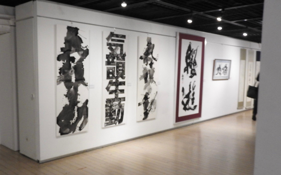
堀内 肇 作品 / Works of Hajime Horiuchi
   |
この書体のアイディは、象形文字から来ています。
複数で1つの作品を成していますが、各1点での購入も可能です。
以前から彼は書の中に色彩を施していました。
以前から彼は書の中に色彩を施していました。
またバッジをベースにしたグラフィック作品も制作していました。
今回は、その集大成を見るような気がしました。
The
idea for this typeface comes from Hieroglyphs.
Although multiple
works make one work, it is also possible to purchase each one.
Normally
Japanese brushing is black or gradations of black, though Horiuchi has
used colour for his brushing for a long time.
He
also created a graphic work based on badges.
This
time, I felt I was looking at a compilation of his works.
 |
| 彼が着ているシャツは彼の作品の1つです。 The shirt he is wearing is one of his works. |
2) 他の人の作品 / Other People's Works
各書道家の名前や作品タイトルはわかりません。
ほとんどの作品は、写真のみ載せます。
いつものように、フラッシュを使用しないので、素敵に感じた多くの作品がお見せする写真の状態に撮影できませんでした。
I do not know the name or the title of each Japanese calligrapher.
 チラシ表面 / Flyer Cover 画像は下記より / This from below ★  チラシ裏面 |
チラシのデザインが面白いです。
上下逆転、両方が印刷されています。
Flyer Back
The flyer is interesting.
Half is up-side down.
画像は下記より / This from below.
★ |
各書道家の名前や作品タイトルはわかりません。
ほとんどの作品は、写真のみ載せます。
いつものように、フラッシュを使用しないので、素敵に感じた多くの作品がお見せする写真の状態に撮影できませんでした。
 |
| 会場 カタログは、すでに無くなってしまっていました。 盛況だったようですね。 会場にはここでお見せする作品の他に、 素敵な作品がたくさんありました。 Venue The catalogue has already disappeared. It looks like it was a success. There were many more wonderful works in the venue more than I show here. |
I do not know the name or the title of each Japanese calligrapher.
I seem to be interested in the Avant‐garde styles and when I realized, most of my photographs are unusual typefaces for me.
As always, I did not use the flash, so my photographs couldn't capture the works I felt were so good.
 |
| 勢いだけでなく、墨のグラデーション、レイアウトが美しいです。 Not only the momentum and the gradation of the ink, but also the layout is beautiful. |
 |
| これは、'伝統の書' ですね? This is the Traditional style, isn't this? |
 |
| 象形文字っぽいですよね。 It looks like hieroglyphics, doesn't it? |

 |
| 黒い糸によって描かれた作品で、 糸は、画面より床へと広がっています。 The work is drawn by a black thread or threads, and the thread extends from the frame to the floor.  |
 書のタイトル:李商隠詩 李商隠 (リショウイン / 812 - 858) は、 晩唐 (836 - 907) に活躍した詩人。 私はこの文字も読めないし、ましてや詩の内容も 全くわかりません。 けれども、文字が金色のラインのドラゴンの上に書かれている ことに気が付いた時、ドラゴン好きの私は興奮しました。 Title : Poet of Li Shangyin Li Shangyin (812 - 858) was a Chinese poet of the late Tang Dynasty. I cannot read these letters, furthermore I could not understand the poem. However, when I realized that the letters are each brushed on the dragons of golden lines, I was excited as one who love dragons.  |
 |
この展覧会では、作者名(書道家名)と作品タイトルの表示が通常の展覧会と違いました。
通常、作品タイトルが作者よりも先に表示され、文字の大きさや太さによって作者名よりも強調されますが、この展覧会では、作者名がタイトルよりも強調されます。
この世界では、誰が書いたかということがタイトルよりも重要視されるのでしょうか?
または、通常、作品の中で、文字 : 書というメディアそのものがタイトルを表示するので、説明部分では、作者名が主役なのかもしれません。
私は、書の展覧会に慣れ親しんでいないので、他の展覧会がどのような表示をしているのかはわかりません。
 |
| アイディアは点字から。なので、 作品はデコボコしているそうです。 The idea is from Braille. The work seems to be bumpy.  動画 / Talk in a Film : ★ |
In this exhibition, the display of the creator's name (calligrapher's name) and the title of the work was different from a normal exhibition.
The title of the work is usually displayed before the author and emphasized by the size and thickness of the letters rather than the creator's name, although in this exhibition the creator's name is emphasized rather than the title.
In this world, who wrote it is more important than its title?
Or, usually in the work, because the medium, the letter : writing : calligraphy itself displays the title, the creator's name may thus be the main or only explanation.
As I am not familiar with a calligraphy exhibition, I do not know how other exhibitions are presented.
 |
| 作者の試行錯誤が窺える気がします。 I feel the calligrapher's trial and error. |
私は興味が前衛の書にあるらしく、気が付いてみれば、私の写真の殆どが、私にとっては、珍しい書体でした。
Most of the works shows photographs only.
 |
| 白に白....このアイディアは私好みです。 White on white .... This idea is my favourite.  |
 |
| DNAの模型を思い起こします。 I recall a model of DNA. |
 |
| ジョアン・ミロ (1893 -1983)を思い起こします。 This works reminds me of Joan Miro (1893-1983). |
 |
| 可愛い文字です。/ It is a cute character. |

作者の試行錯誤以上の '悶え' が感じられる生々しい作品です。 It is a graphic work, I feel 'agony' rather than the calligrapher's trial and error.
|
 |
| 現代美術のギャラリーや美術館に点されていそうな作品です。 This work looks as if it is an exhibit in a contemporary art gallery or museum. |

中右 : 山本尚志 (公開制作 動画 : ★)
写真の人物は来場者です。
Public Creation in a film, ★ only in Japanese)
Visitors in the photograph.
|


極
坂巻
裕一 作
ポスターやチラシに使用された作品
: "極" は、
会場の最も奥に展示されていました。
「絵か書か?」という質問に、彼は、
「絵を描こうとして作ったら、こうはならなかったでしょう」
ということでした。
もっと興味のある方は、ギャラリートーク
: ★をご覧ください。
Kyoku
(Pole in Japanese)
by
Yuuichi Sakamaki
The
work was used for posters and flyers and
exhibited at the back of the venue.
The calligrapher was asked the question
"Is this painting or brushing (calligraphy)?"
He
answered,
"I
could not have done this if I would paint a picture."
If
you are more interested, please see Gallery Talk : ★ in
only Japanese.
|
 (記号という意味では、書なのかしら?) ですが、"書" か、そうでないか、 "アート" か、そうでないか、 という類の問いは、一般論では答えがでないように思います。 For me, this work is a painting or symbol. (In the sense of a symbol, is it calligraphy?)
But "writing (calligraphy)", it is not, "Art" or not,
I
think that this kind of question does not have one general theory.
|
楽しく、面白い展覧会でした。
一緒に行った友人も喜んでいました。
良い刺激を受けました。ありがとうございました。
It was an enjoyable and interesting exhibition.
My friends who went with me were also happy.
Thank you for the wonderful stimulation.
0 件のコメント:
コメントを投稿